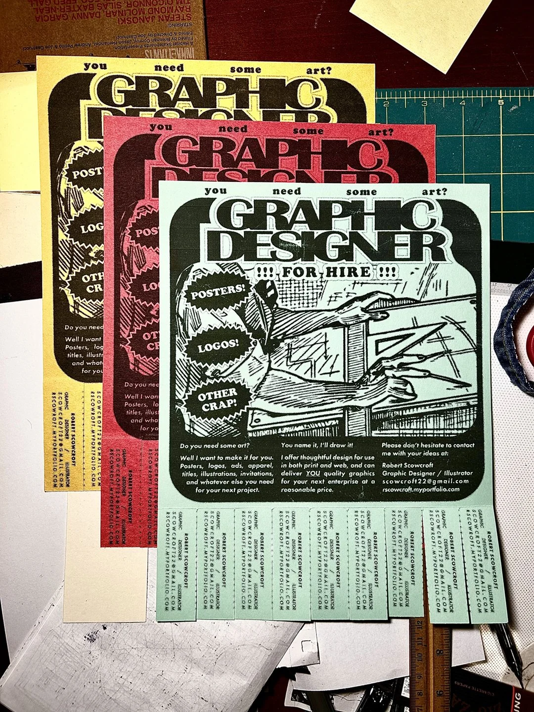
Posters
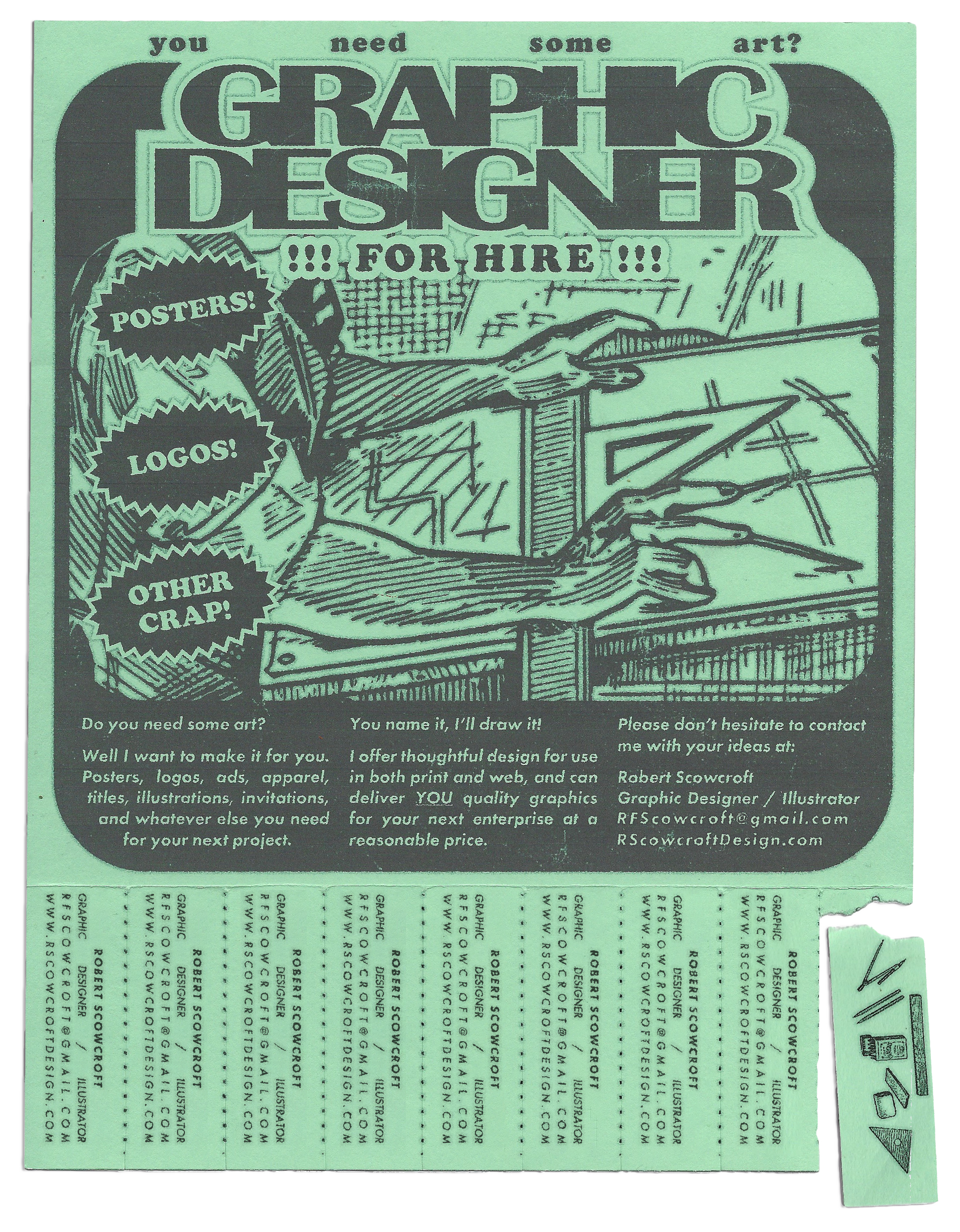
design for Hire
Typography, Copy, Page Layout
2023
“You need some art?”
My early attempt at drumming up business the old fashioned way.
I wanted to create a promotional device that was evocative of mid-century design aesthetics and advertising practices, and that invited engagement from the viewer. I felt a tear-tab poster fulfilled the criteria I had set for myself, and communicated my focus as a designer on tactile print centered work.
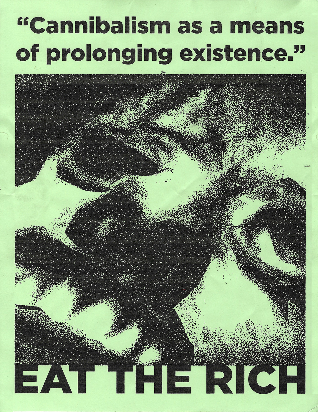
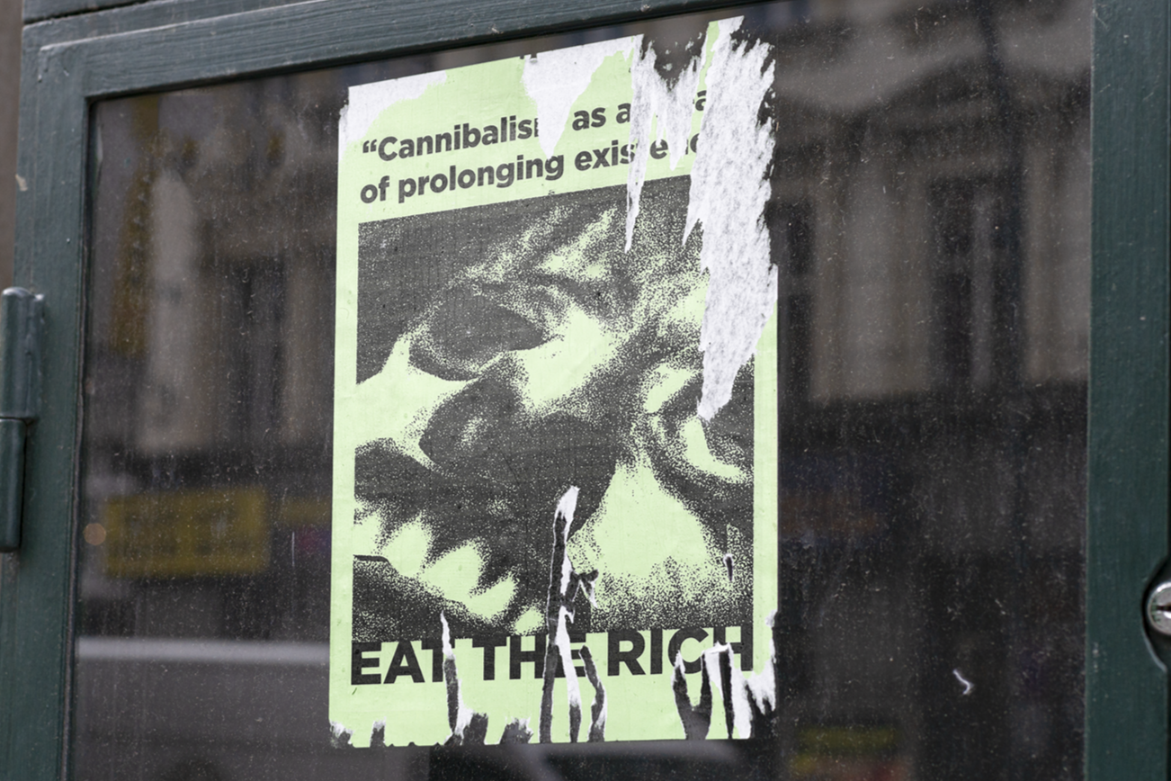
Cannibal
Typography, Collage
2025
“...It is evident our wretched countrymen had been driven to the last resource - cannibalism as a means of prolonging existence…”
A poster commissioned by a local SLC punk band. The group, named Cannibal, only ever played one show before disbanding forever.
The imagery for the collage was pulled from the 1988 PBS Nova Documentary “Buried In Ice” about a failed British Naval expedition to the Arctic that resulted in the death and disappearance of 129 men. The tagline of the poster was pulled from an 1854 report on the expedition.
Though the band who commissioned the poster was short lived, I am still proud of the final result and message of the work.
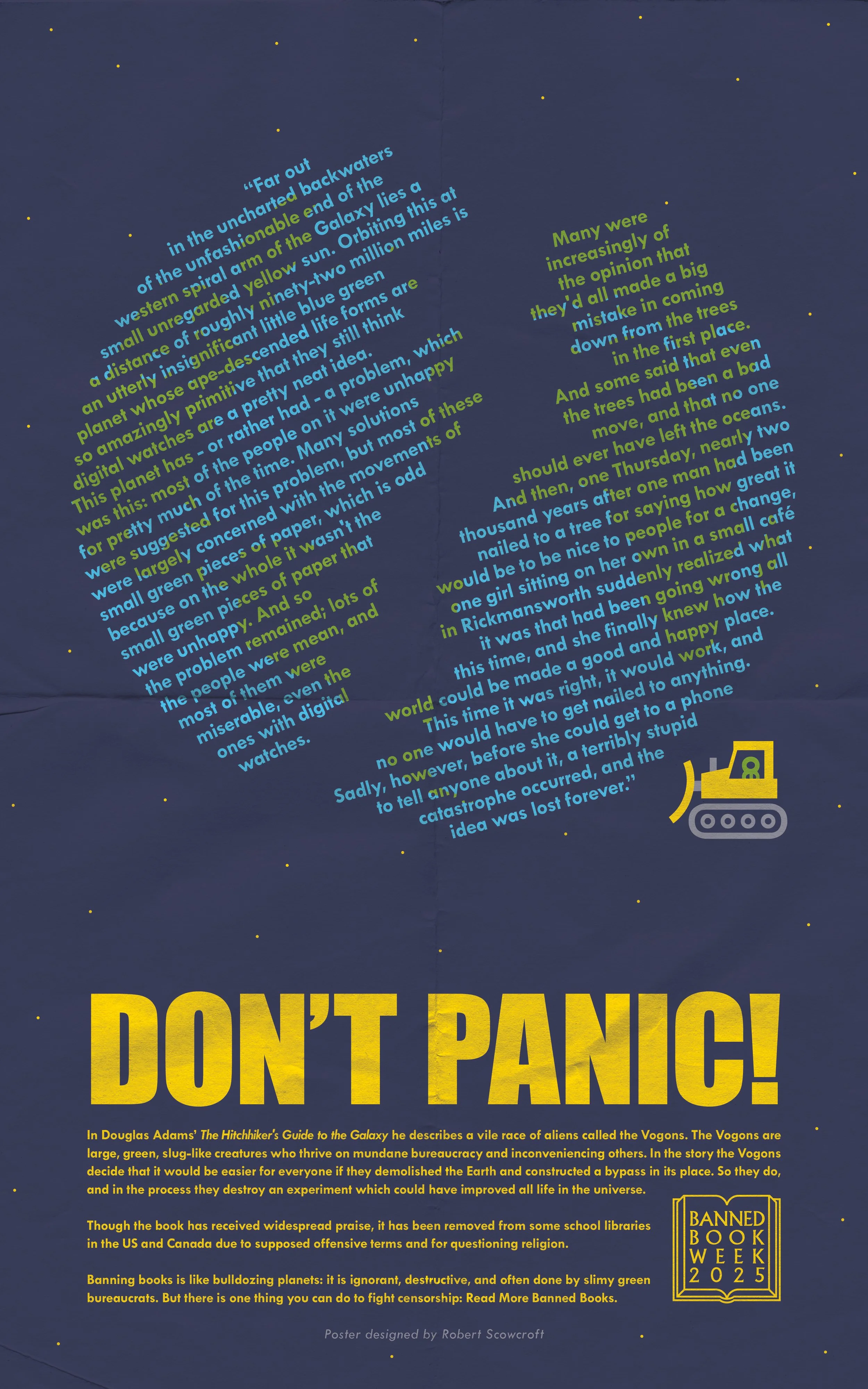
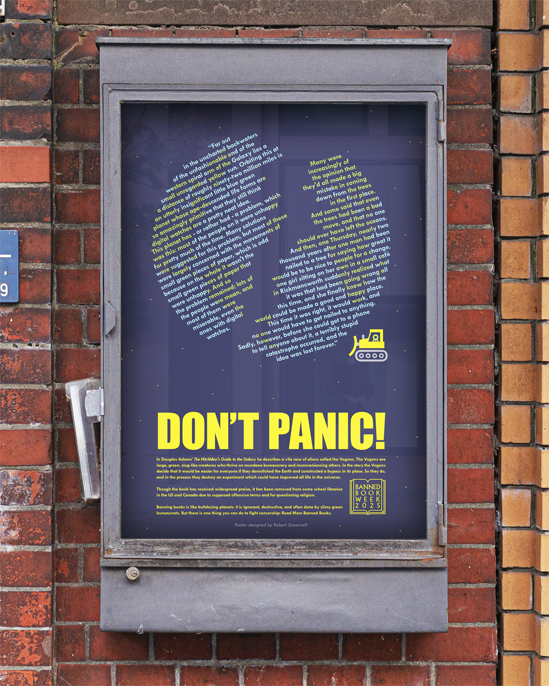
Banned Book Week 2025
Typography, Copy, Page Layout
2025
“Don’t Panic!“
This poster was made for Banned Book Week 2025, The poster was displayed at Salt Lake Community College alongside posterworks by other artists. All the posters were based on different banned books, and as design challenge to the artists all visual elements were required to be created using only glyphs from typefaces (for example the bulldozer in my poster is made out of the glyphs: 1, L, /, ), œ, and Ů).
For my poster I chose to represent “The Hitchhikers Guide to the Galaxy“ by Douglas Adams, which has been removed from some school libraries in the US and Canada due to supposedly questioning religion and for use of “offensive terms”.
For the visuals I wanted to recreate a scene from the book, and I felt the scene where the Vogon’s demolish the earth was a good thematic parallel to the action of banning books.
One element of the design that I’m particularly proud of is the globe. By turning the globe into columns of type I was able to utilize the ragged edges to create the impression of a gnarled crack bisecting the globe.
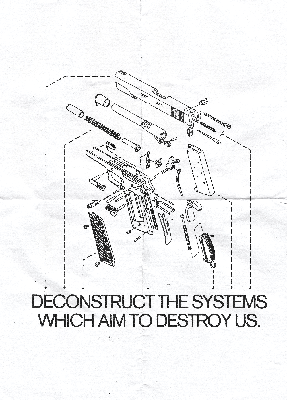
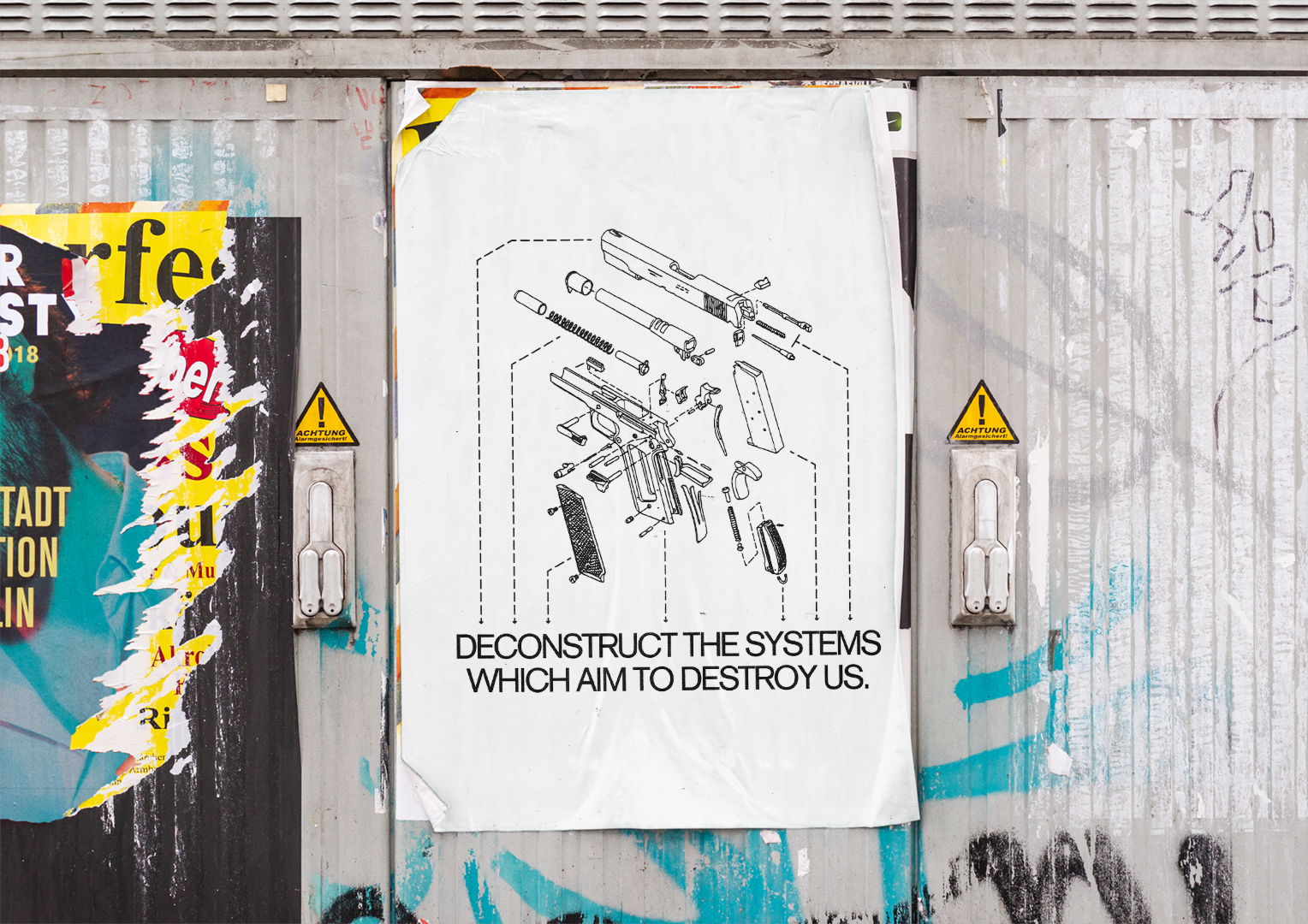
Deconstruction
Typography, Collage
2022
A poster I created for an anti-gun violence graphic design challenge.
In the same way that a gun is a machine made of separate parts, so too are systemic issues such as violence, racism, and inequality. I chose to represent these systems as a weapon themselves, and to express that though these issues may seem insurmountable, they can be broken into manageable pieces and ultimately disposed of. To illustrate this idea I co-opted visuals from the Firearm industry and tweaked them in a way that reframes and expands upon their meaning.
Copies of the poster were pasted on telephone poles, bulletin boards, and prominent walls around the Salt Lake City area.